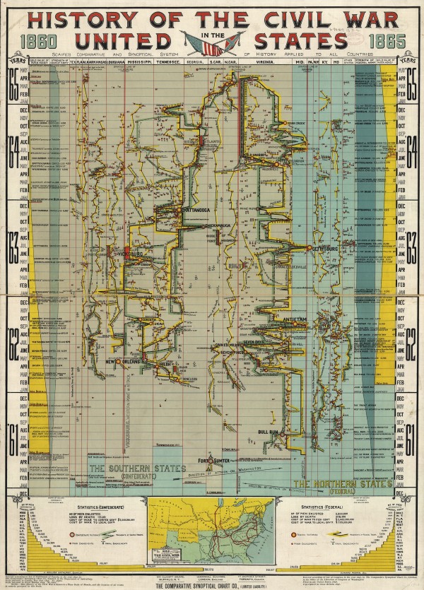
SLATE: This chart, digitized by the Library of Congress, depicts major battles, troop losses, skirmishes, and other events in the American Civil War. (Click HERE for a zoomable version, or visit the LOC’s website.) The “Scaife Synoptical Method,” advertised at the top of the timeline, aimed to fit as much information as possible into a single chart. Information on Arthur Hodgkin Scaife is scant, but the Comparative Synoptical Chart Company, apparently based in Toronto, also published his “Synoptical Charts” of the “Cuban Question,” English history, and the life of William Gladstone. In a 2010 New Atlantis review of historians Daniel Rosenberg and Anthony Grafton’s book about timelines, Alan Jacobs pointed out that interacting with completist charts of history, reproduced at any scale, can be a trying experience:
Figuring out how to view these charts properly would not be easy even for a person looking at the original. Get close enough to note the details and you lose sight of the overall pattern; stand far enough back to discern that pattern and you lose the details.
Jacobs’ criticism certainly applies here. A war is a complicated thing, and the chart has tried to track so many factors—geographical, political, and financial—that it’s easiest to concentrate on one or two of these at a time. MORE
PREVIOUSLY: Seven Score And Ten Years Ago

