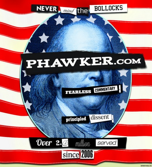
Take a good look at the old Phawker, it’s your last chance. Later today Phawker will be unveiling a radical site re-design. Bold. Clean. Sharp. Uncluttered. Easier to use, easier to read, and easier to tell all your little friends about. Great taste, less filling. Even better than the real thing. No, this isn’t the new look, it’s a full-page, four-color ad trumpeting our makeover on page 40 of this week’s issue of the City Paper which hits the street today. See you on the other side.
Curated News, Culture And Commentary. Plus, the Usual Sex, Drugs and Rock n' Roll

